Work / Coworking / Real Estate
Branding an Oregonian coworking startup in a growing market
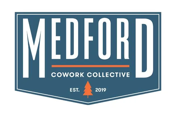
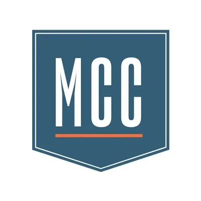
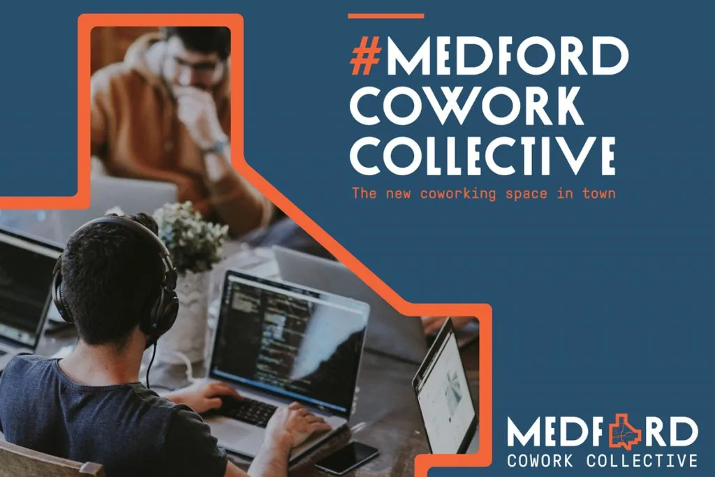
A complete brand identity for Medford Cowork Collective — logo, a 24-icon library, and a design-forward system that gave a new coworking space credibility.

Branded. A map-driven identity system the MCC team now extends in-house, without formal design support.
Being a solopreneur, consultant, individual professional, or any other form of a remote or individual worker can be isolating and lonely. For many, community and meaningful daily relationships are found through our places of work. Those who work remotely or individually miss out on this. Coworking spaces present a solution to this issue by providing affordable office space with a comfortable third-place environment where remote workers can come together and form community. Medford Cowork Collective brings this solution to Medford, Oregon and the remote workers and solo professionals of the Rogue Valley. Quarry developed a brand identity system for MCC which communicates its support of work, community, and balance. The brand is centered upon maps, through which space and connectedness are communicated. This accurately communicates the product and service that MCC offers—space and community.
Quarry worked directly with MCC founder Abigail Schilling on the development of the identity system. Abigail founded MCC out of recognizing the need for such a space in the community after relocating to Medford as a solopreneur herself.
The brief
The intentions for the brand system were an exciting combination of fairly opposing concepts, lending to a compelling sense of balance. Some of the descriptors that we received during discovery were:
- old & new
- rural & urban
- history & future
- agriculture & tech
- outdoor recreation & business
One of the main objectives of the brand system was to celebrate the industrial history of Medford while staking a claim as a young, new enterprise which itself supports a new generation of entrepreneurship.
The mood that we received from the MCC team was a fantastic starting point for our creative process. Included were samples of gorgeous 50s era design, such as signage, fruit shipping boxes, business charts and documents, and labels.
The process
We began the design process with research on the history of Medford. Asking questions like what kind of design had come from the area in the past? How were brands from the region positioning themselves? Were there any regionally common type treatments? We began iterating some early concept sketches using the influences present in the mood board and those that we collected in our research.

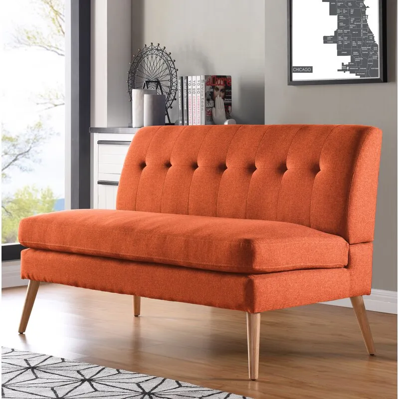
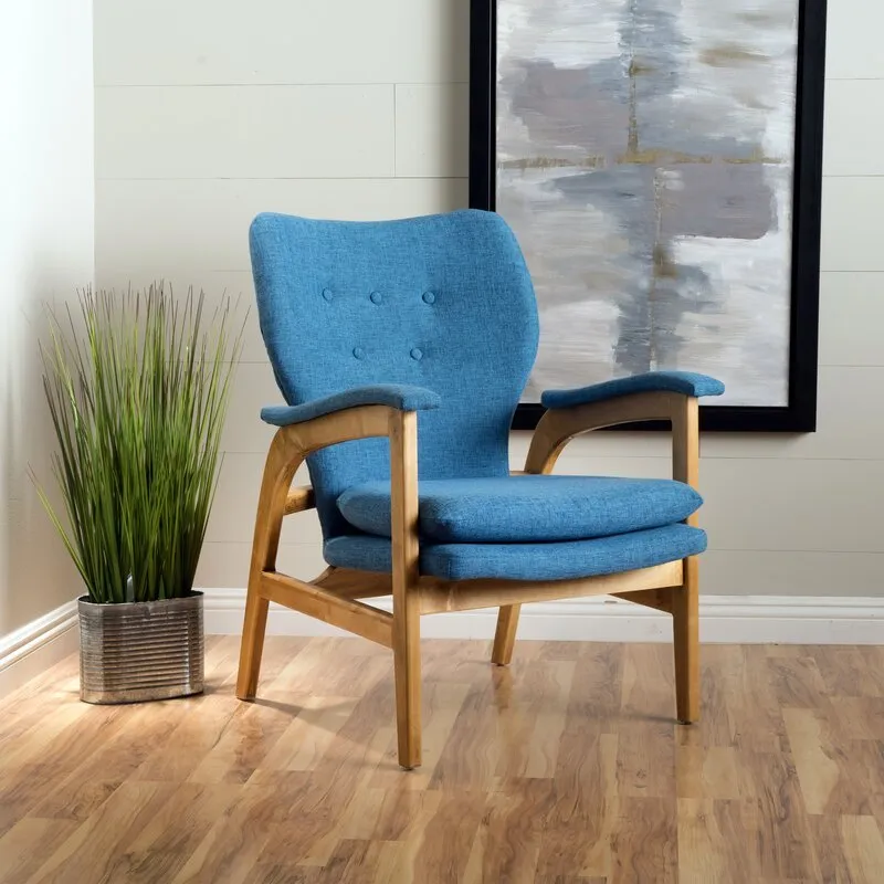
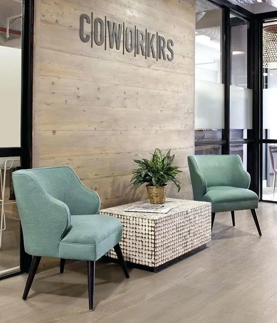
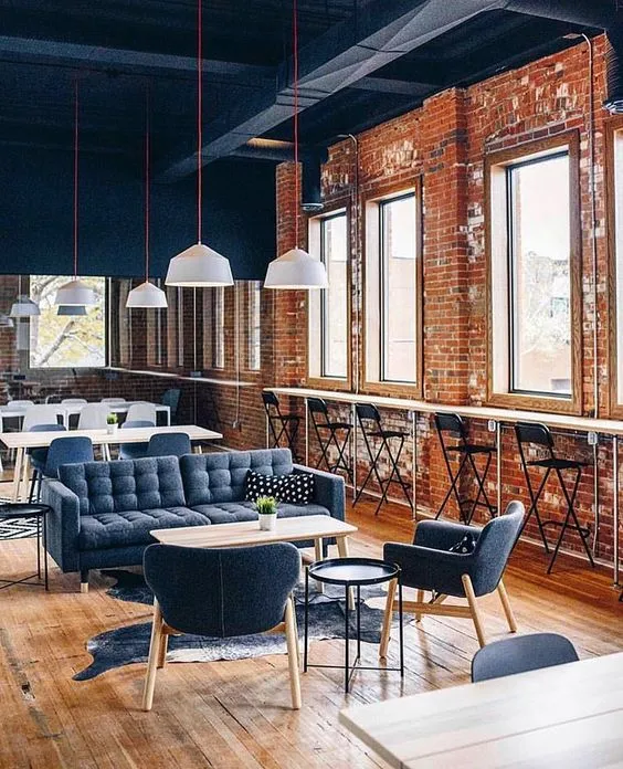
Something that was unique to the MCC branding process was the fact that the interior of the space was being designed in tandem with the brand identity. This allowed the interior design to significantly inform the brand design. The brand system takes many cues from the interior of the space. Specifically, the color palette, which came directly from a number of the furniture pieces that were chosen for the space. This cohesion helped to strengthen the brand and form a deep connection to the physical presence of the space.
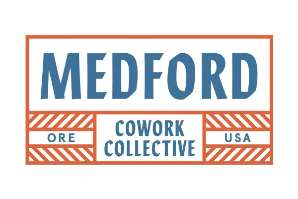
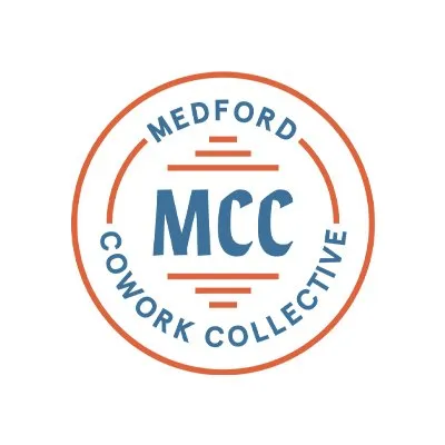
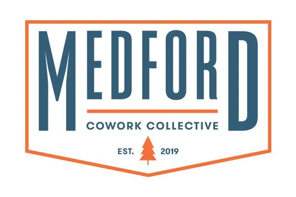
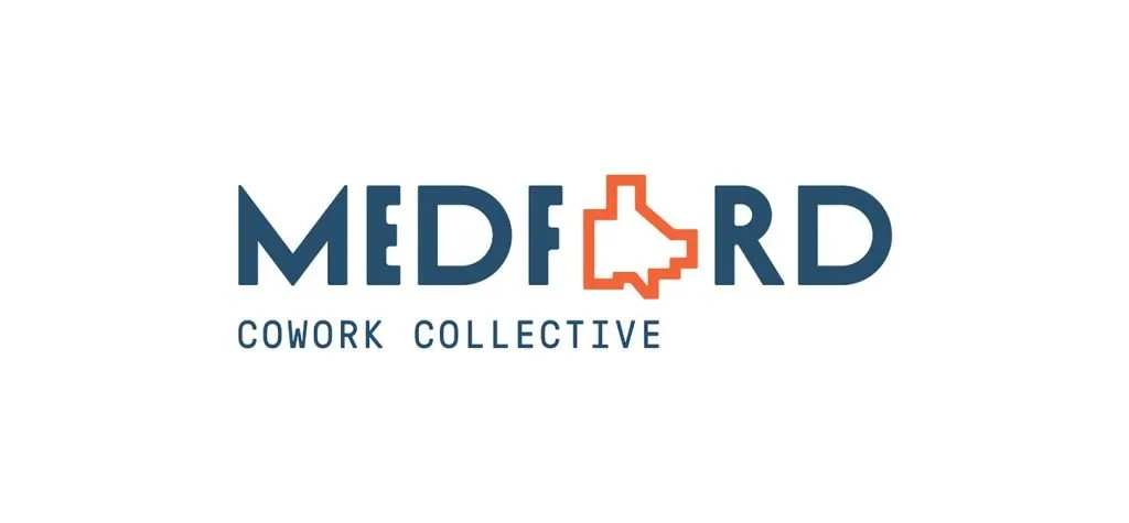
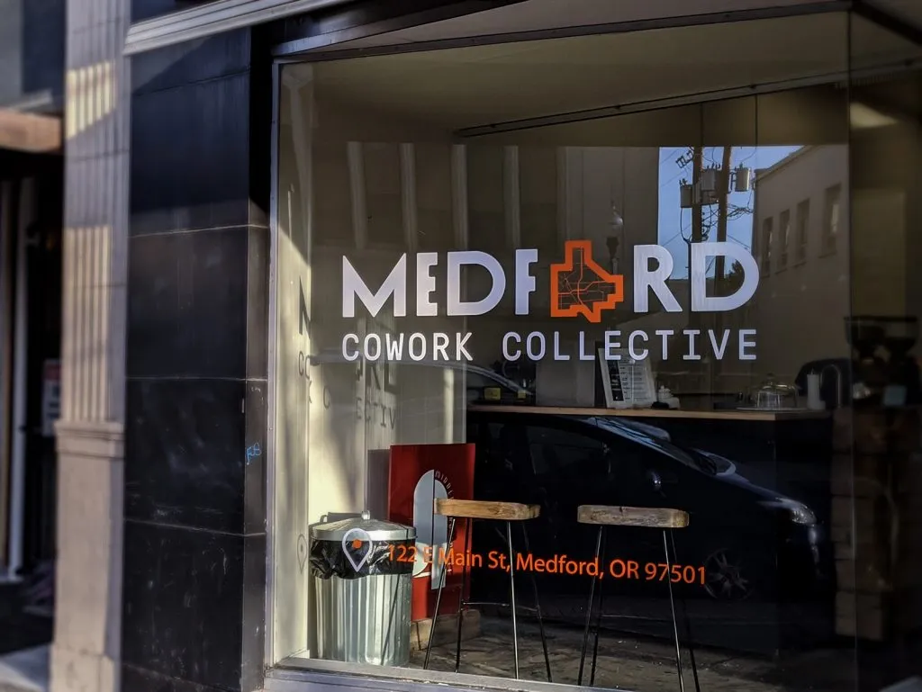
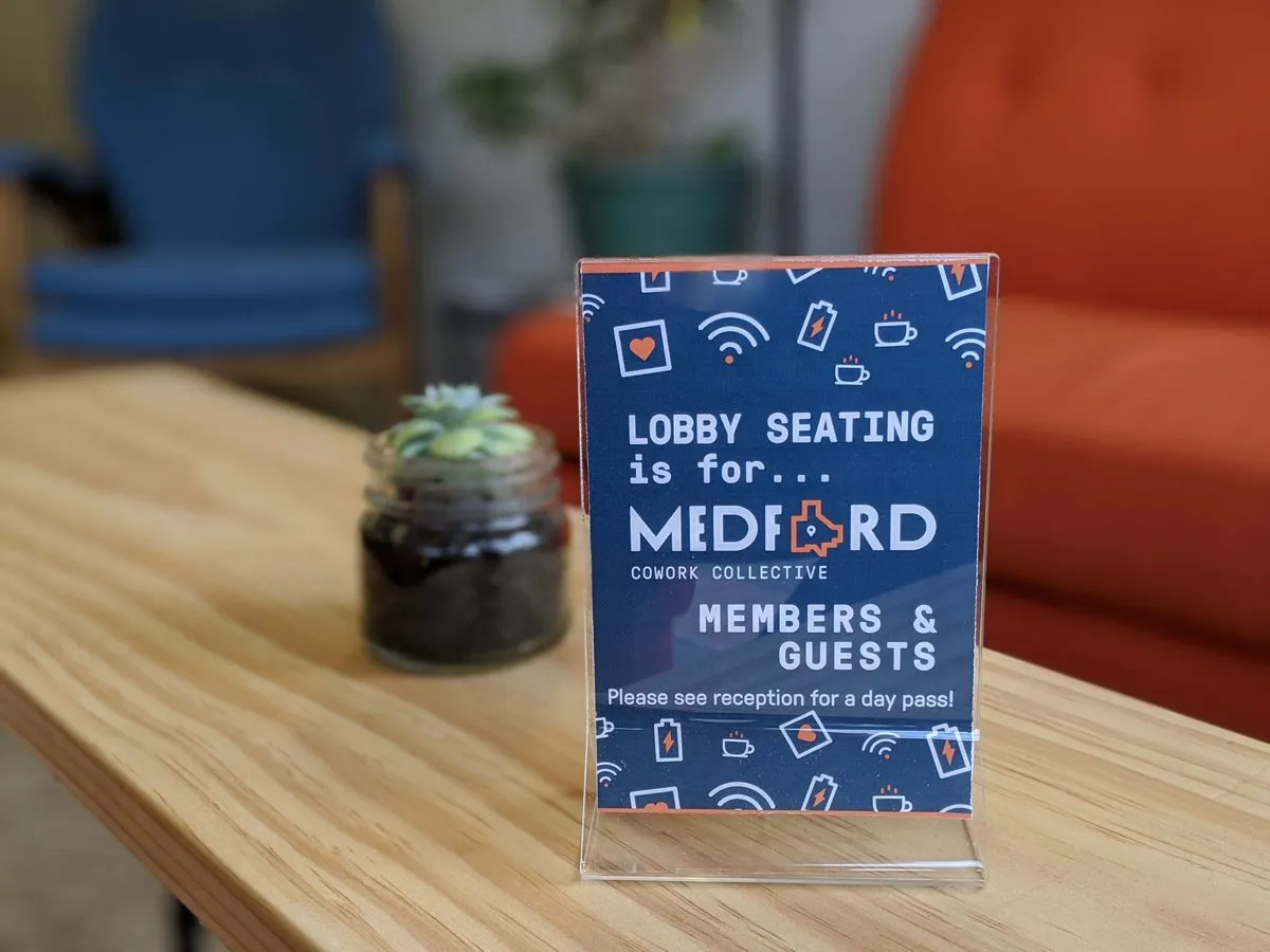
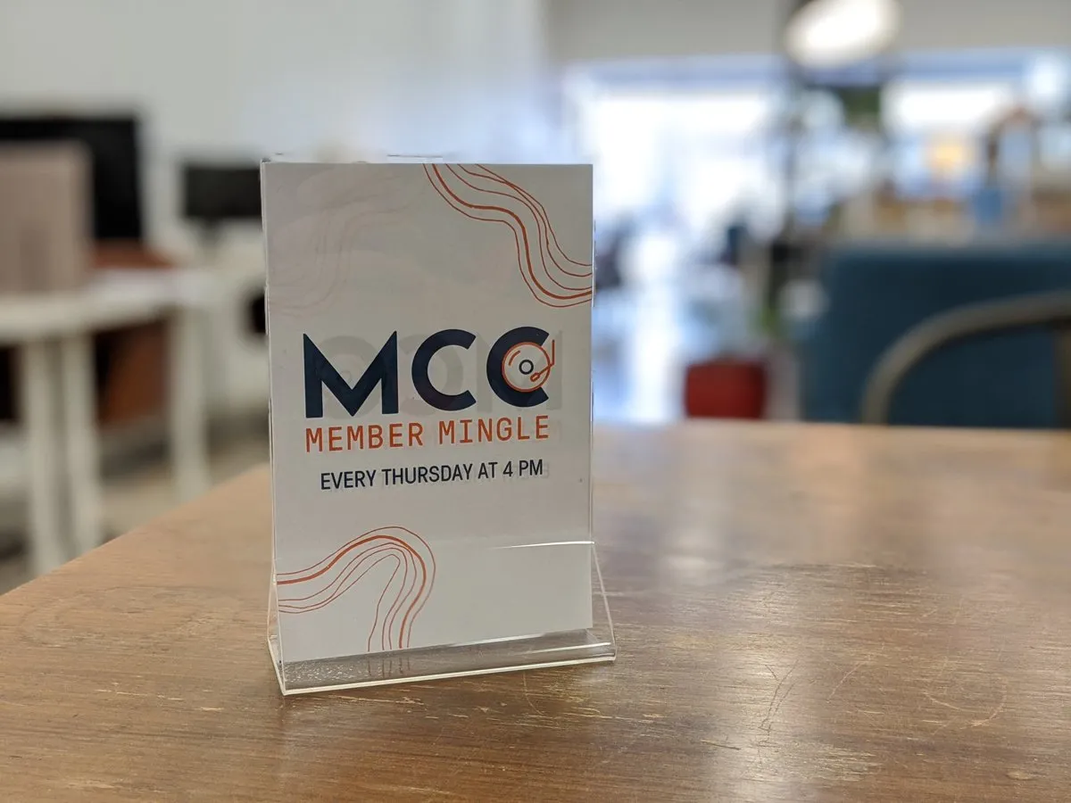
Eventually, we arrived at the idea of visualizing the city as a physical part of the brand. We created a concept sketch that used the city limits as an icon for the mark.

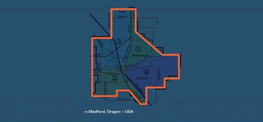
We combined this city limits icon with a mixed-base typeface which has a vintage atmosphere, strong angles, and complementary edges that resulted in a consistent mark that communicates space, history, and coming-together.
The map proved to be an extremely versatile piece of the visual language with widespread utility.
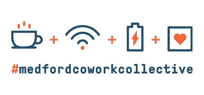
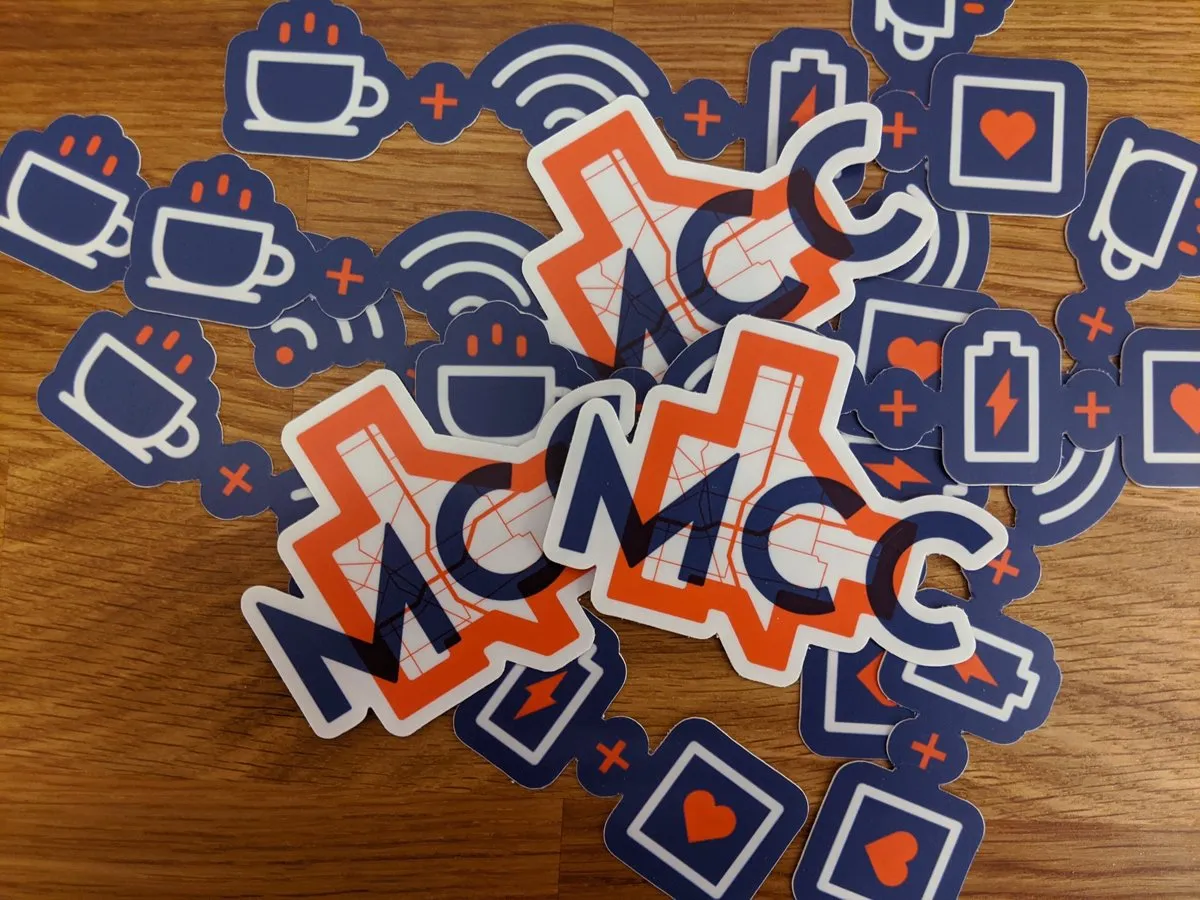
To further extend the brand visual system, the MCC team wanted to create an icon language to further communicate core concepts of the brand and product offering in a simple and effective way. We began this process with a rough sketch of four icons that summarize what a cowork is.
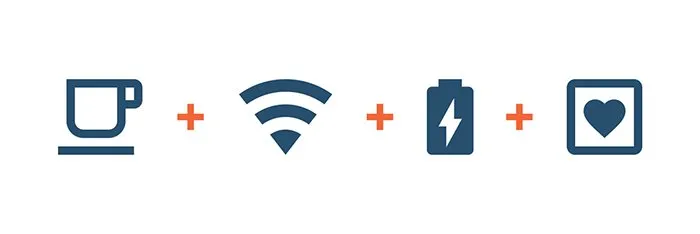
This set was then refined to cohesively fit into the established pieces of the brand’s visual language. From there, we ended up developing a complete library of icons that represent individual features and concepts of MCC and coworking, plus some icons representing previous or current products produced in the surrounding Medford area.

The result
The final product for the Medford Cowork Collective identity is an intelligent but accessible, refined yet simple brand system that is both extensive and robust.
The visual language provides tools for working within an extensive variety of different use-cases. Thus positioning MCC as a mature and organized brand that values design.
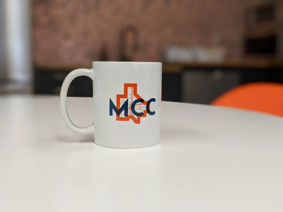
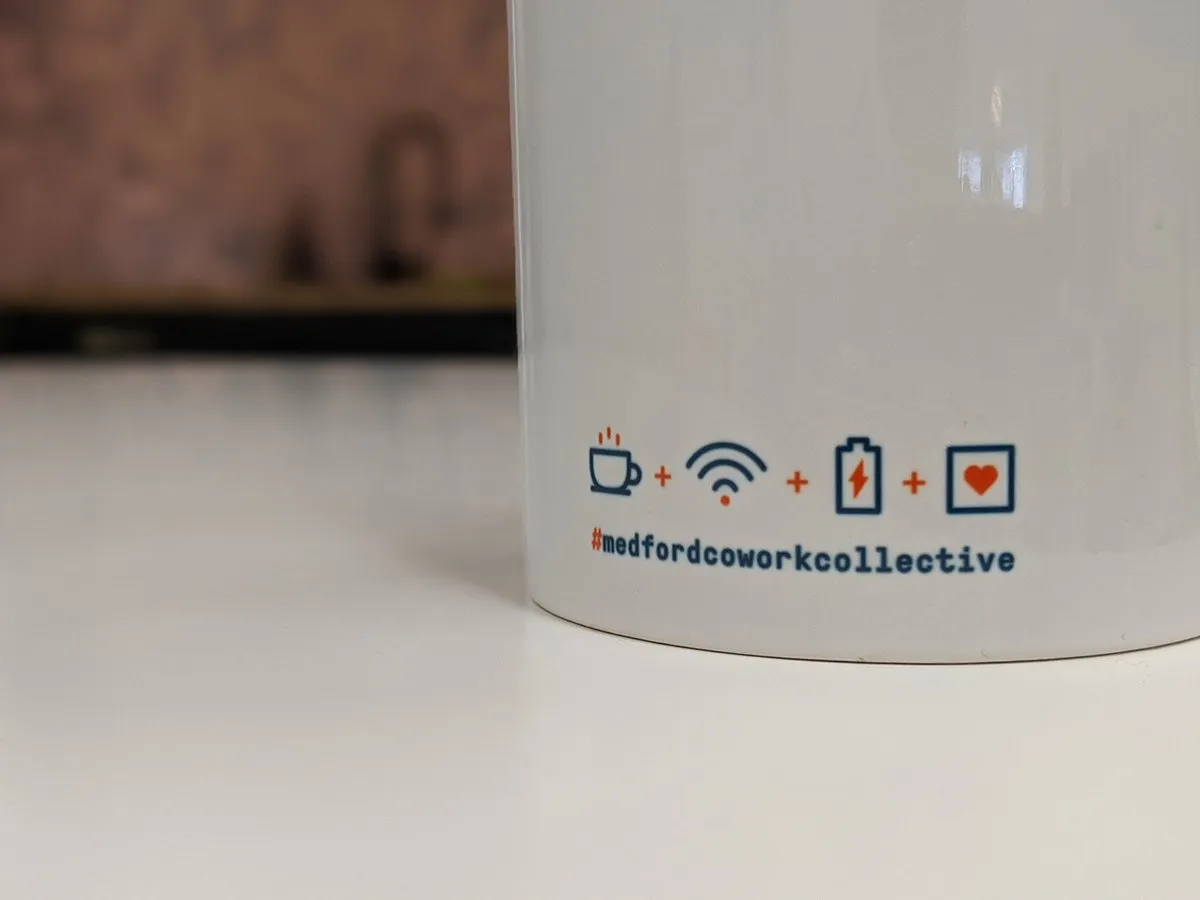
It has been easy for the team to work with the brand system internally to design and develop beautifully branded creative and collateral all on their own, without the need for formal design support.
“Quarry was instrumental in taking our initial ideas and turning them into a polished, phenomenal brand identity. The outcome is a solid, design-forward look that we can be proud of for years to come.”
Abigail Schilling Founder / Medford Cowork Collective
More work
-

10× revenue growth
Growing a travel membership from $2M to $20M ARR
 Harvest Hosts
 -

Unified.
From siloed tools to a single source of truth: a data platform and self-serve BI for a pharmacy group
Confidential -

$40k week-one revenue lift
Optimizing a membership signup flow into a $40k week-one revenue lift
Harvest Hosts